My Laptop's had to be wiped. Pretty much all of my college work's safe, but...
Reinstalling all the software's going to be fun.
Thursday, 19 March 2015
Monday, 9 March 2015
My Digital Media Project - What I've Been Up To
Well, first of all, I've been doing sketches of the Paladin character. I decided to use a heavier, rounder basis for the character, reminiscent of Amethyst from Steven Universe. As she is based around the Paladin archetype, her signature weapon could, logically, only be a sword or a shield. I decided on the latter, to make it more distinct.


After marathoning Sailor Moon a little more than might be recommended, I thought of possibly having the paladin character being a transforming hero, in the same vein. I sketched this costume idea before I came to the conclusion that the Sailor Moon inspired might be a little too much. However, I do like some of the armour pieces, inspired by a piece of art from the anime Revolutionary Girl Utena. I also decided that I liked the idea of having a ludicrously large shield, with handles on the back so that the character can grab one handle and swing the shield as a weapon.

This led to me doing several designs of the shield. I briefly tried a few designs for a smaller shield design, but I found them less satisfying, and less striking, than the idea of the character swinging a shield around that was as large as her. However, the original design for the large shield, as you can probably tell, would be hellish to draw consistently, hence the simplified version beside it.
I also began to sketch the turnarounds I would use on Donkeyskin's character sheet, but I quickly remembered why I do not usually use my higher quality pens. My preferred drawing pads have very absorbant paper, and, when using a higher quality pen, it soaks up the ink in the line and makes the drawing blurry. This annoys me to no end. I also realised when I was inking that I found the drawing generally unsatisfying, it didn't have any energy, and Donkeyskin was starting to look an odd shape.

While watching some students from another course (Theatre, I presume, due to the fact that they were all doing speeches from plays (and one made a terrifying Hamlet)), I sketched and inked most of Donkeyskin's final illustration. It is of the climactic reveal, when Donkeyskin removes her fur coat to reveal the gown made of moonbeams, hidden underneath.

I based the frame around the drawing, and Donkeyskin's pose, on the art nouveau style, though simplified, in the case of the frame. I feel as though the prince and his servant look slightly out of place, timeline-wise, but I don't doubt that this is something that shouldn't be terribly hard to fix, should it bother me enough to do so. I've still not decided on what is going to fill the top right corner, probably more astonished courtiers or something similar. I outlined a box at the bottom of the linework, in which I intend to briefly describe what is drawn in the picture, a practice which I have observed to be common in Fairytale illustrations.
Lastly, I "attended" a livestream by a pair of fandom artists I admire. It was greatly informative, and I asked a great deal of questions about their workflows, which taught me some interesting tricks for digital colouring in Photoshop.

[Amethyst, from Steven Universe, for reference]
This led to me doing several designs of the shield. I briefly tried a few designs for a smaller shield design, but I found them less satisfying, and less striking, than the idea of the character swinging a shield around that was as large as her. However, the original design for the large shield, as you can probably tell, would be hellish to draw consistently, hence the simplified version beside it.
I also began to sketch the turnarounds I would use on Donkeyskin's character sheet, but I quickly remembered why I do not usually use my higher quality pens. My preferred drawing pads have very absorbant paper, and, when using a higher quality pen, it soaks up the ink in the line and makes the drawing blurry. This annoys me to no end. I also realised when I was inking that I found the drawing generally unsatisfying, it didn't have any energy, and Donkeyskin was starting to look an odd shape.
While watching some students from another course (Theatre, I presume, due to the fact that they were all doing speeches from plays (and one made a terrifying Hamlet)), I sketched and inked most of Donkeyskin's final illustration. It is of the climactic reveal, when Donkeyskin removes her fur coat to reveal the gown made of moonbeams, hidden underneath.
I based the frame around the drawing, and Donkeyskin's pose, on the art nouveau style, though simplified, in the case of the frame. I feel as though the prince and his servant look slightly out of place, timeline-wise, but I don't doubt that this is something that shouldn't be terribly hard to fix, should it bother me enough to do so. I've still not decided on what is going to fill the top right corner, probably more astonished courtiers or something similar. I outlined a box at the bottom of the linework, in which I intend to briefly describe what is drawn in the picture, a practice which I have observed to be common in Fairytale illustrations.
Lastly, I "attended" a livestream by a pair of fandom artists I admire. It was greatly informative, and I asked a great deal of questions about their workflows, which taught me some interesting tricks for digital colouring in Photoshop.
Tuesday, 24 February 2015
My Digital Media Project - Change of Plans
So I may have overestimated myself. I overstretched my abilities, planned out my project in a way that it's proven to be too much. However, doing so has helped me in a way, at least helped me have a better understanding of what I want to do.
Firstly, I set up, in my original plan, the five briefs, and each one had it's own deadline, and several pieces that would make up the finished product. However, I set that up before I really had to start worrying about keeping the deadlines in my plan and the actual hand-in deadlines for college straight. The simple act of remembering what my deadlines were verses remembering the college hand-in dates turned out to be more stressful than it was worth. I have little to no worries about the work, that I could do everything I set out, but the deadlines scuppered me and sent me into a bit of a panic. My understanding of what I was doing kind of fell apart in the face of the college hand-in deadlines, and I have a problem where if I don't understand what I'm supposed to do, I won't do anything.
I also set them up to cover a wide range of purposes and markets, because at the time, I hadn't been sure what I wanted to do or what my target market would be. However, since then, I've gained a stronger understanding of what I want my career to look like, started to really think of myself as an illustrator, first and foremost.
In response to these problems, I took some advice I'd heard a few times, and reduced the number of briefs from five to three, specifically, Robo, Donkeyskin and the Paladin. I was upset over the fact that I hadn't completed any of my briefs to their original deadlines, but this way I should be able to finish them now, for the Realisation hand-in. Also, I'm just really fond of Robo, and still like drawing Donkeyskin. With this change of plans, the original deadline plans are kind of getting thrown out the window. Instead, I'm going to work on finishing off Robo and Donkeyskin while also doing the Paladin.
Which is currently involving some interesting Google Image searches for inspiration...
Thursday, 5 February 2015
My Digital Media Project - Brief 2 - Some stuff I forgot to post about
I did some more sketches, and I feel confident that I have finalised Donkeyskin's design to my satisfaction.

These are sketches for Donkeyskin's dress before she ran away, along with sketches of how her appearance would change after she did so. I looked up stuff about regency fashion, including what regency era aprons looked like, though I decided not to add an apron to the rags. I liked the idea that, after she'd ran away, at first Donkeyskin's dress would be in tatters, but over the course of the story, it would be slowly mended. I felt it was a nice metaphor for her healing from the terror her father's madness would have caused her.


These are sketches for Donkeyskin's dress before she ran away, along with sketches of how her appearance would change after she did so. I looked up stuff about regency fashion, including what regency era aprons looked like, though I decided not to add an apron to the rags. I liked the idea that, after she'd ran away, at first Donkeyskin's dress would be in tatters, but over the course of the story, it would be slowly mended. I felt it was a nice metaphor for her healing from the terror her father's madness would have caused her.
I actually drew the face sketches while waiting for a doctor's appointment. Again, I looked up some regency hairstyles, but in this case, I chose the bottom right, which was not pulled from research. I wanted Donkeyskin to look both practical and graceful, but I also wanted to give her a hairstyle that wouldn't be too hard to mess up, while still having her be recognisable.
Finally, Donkeyskin's ball gowns. In the fairytale, Donkeyskin goes to three balls held by the prince in three different dresses. One dress supposedly made of sunlight, one of starlight and the last of moonlight. Taking sun, moon and stars for the dress themes, I took some of the ideas from the initial sketches, and some research into regency era ball gowns. My personal favourite is the moon dress, which has a very appealing silhouette, and, once the phases were changed to a pattern along the hem, it's theme is very subtle, but noticeable when you know it's there. The first iteration of the starlight dress was based on a particular regency dress I found in my research, however I felt that the dress didn't work so well with my art style, and redesigned it. I liked the idea that there was an element of escalation through the balls, and therefore the dresses. The sunbeam dress is worn on the first night, and has a fairly simple design. The starlight dress is worn on the second night, and while more glamorous than the sunbeam dress, it's still somewhat less so than the beautiful moonlight dress, worn for the climactic reveal.
Friday, 30 January 2015
My Digital Media Project - All Briefs - More In-Depth Explanations and Thoughts Thus Far
Brief 1 - Brief 1 was a mascot for a professional event, like Pictoplasma. An event where professionals in the sector would meet with each other, give talks, etcetera. This character, whom I nicknamed Robo, was intended to be a pleasant, happy character, yet one who had a slight melancholy about him. I wanted him to look like he had a life behind him, plausibly quite a long one. The final products I want for the Realisation handin are a character sheet, a reusable vector image of Robo, and a banner made using said vector image. Through working on him, I gained some extra practice in using Illustrator and Photoshop, though I am already familiar with these.
Brief 2 - Brief 2 is the main character from a lesser known fairytale. I, personally, prefer to call the fairytale Donkeyskin, but it has several names. This character has a rather traumatic backstory in the fairytale. This character's final products are to be her character sheet, three designs for the three gowns in the story, and a completed illustration of a point in the story. I rearranged the order of the briefs almost specifically because I wanted to do this one within the development deadline. This is the one I really want to do well, because it is the one most heavily placed in my area of interest, and using techniques that I enjoy.
Brief 3 - Brief 3 is a comic book protagonist, based on the archetype of a Paladin. A Paladin is a common class in Roleplaying Games, especially those set in High Fantasy worlds. However, one iteration of the paladin archetype I have not seen is one in an Urban Fantasy setting, a person in a modern world who has the abilities associated with Paladins. This was the concept I wanted to play with. This character would follow a fairly formulaic Urban Fantasy plot, where an Everyman character would gain unexpected supernatural abilities. Usually, though, these abilities would be based around a different archetype, say a witch or a medium, I've never seen it done with a Paladin. The final product of this brief is to be a character sheet and a page of her story, made using Manga Studio, with the help of a tutorial site I found.
Brief 4 - Brief 4 is a merchant character for a video game aimed at children. Merchant and Smith characters in video games, in particular RPGs, tend not to look very different from each other. Sometimes, I'd swear the smith characters were all the same man. Because of this, I think it'd be interesting to find something different to try, another angle for the character. However, this character's final prototype would be their character sheet, and an at least basic 3D model of them. While I have used some of the software before, I am not extremely confident in it, and I understand that there are differences between what I've learned about the software and how it is supposed to be used in creating assets for video games. This is why I have gotten in contact with another student, James, who works in the video game industry. I've asked him for help, when I roll around to this brief.
Brief 5 - Brief 5 is a mascot for a family friendly chain of Italian restaurants. The final products would be a character sheet and a short animation using Flash or After Effects. Originally, this was the first brief, but after some thought, mainly on the fact that I don't actually have easy access to the software required to do it, I decided to make it the last instead. Due to this sequence of events, I have done a good deal of thinking and made some very basic sketches. Originally, I was going to use an Italian cook as a base for the mascot, but I felt that was too obvious, too cliche. Instead, I decided to use an Italian grandmother, because I felt that would be a more interesting choice. There are several Grandmother tropes that I felt would be more fun to play with, such as grandmothers who have surprising backstories, tales of adventure and romance that clash with the wholesome image connected to old women.
Wednesday, 14 January 2015
My Digital Media Project - Brief 2 - Initial Sketches

These are initial sketches. At first, I thought I'd try to design the coat, the iconic appearance of the princess in Donkeyskin, and also decide whether the coat would literally involve a donkey's skin as the head. However, when I had trouble visualising the coat, it struck me that I could try the design process a different way.
I own a number of old How-To-Draw books, and one which is particularly well-loved is "How To Draw Magical Girls" by Chris Hart. "Magical Girls" is a genre of Manga and Anime, which features a young (usually 10 - 18) girl who gains magical abilities, which usually include a transformation into a glamorous Magical Girl form. In this book, the author advises the reader to design the magical girl first, and design her ordinary appearance afterwards. This helps the artist establish the character, and means that they are less likely to go too far with the magical design, to the point where it looks ridiculous.
Because of this, I decided to do some preliminary sketches of the three dresses from Donkeyskin. These were mostly just me deciding on a theme for the three of them, what kind of fashion I wanted this fantasy kingdom to have. I tried out several ideas, icluding:
a dress inspired by the fashion of the Regency era in England, such as the setting of the work of Jane Austen.


Stereotypical, vague "fairytale" dresses, not particularly based on an era. I, in the comments written on the page, made a jab at the fact that I felt one looked an awful lot like the dress worn by Odette, the main character in "The Swan Princess".
And, finally, a dress based on the stereotypical "Southern Belle", similar to the women in "Gone With the Wind".

I like the Regency dress best, and I feel it works with it's theme the best out of them, so I will be doing more sketches of the various dresses featured in Donkeyskin using the Regency style. Even so, I very much like the Southern Belle dress, and may be considering filing it away for use elsewhere in the future.
Friday, 9 January 2015
My Digital Media Project - Brief 2 - Robyn Gets Overexcited For Drawing Donkeyskin
The second brief in Scheherazade: Living On a Tale is based around the idea of a book of lesser known fairytales, specifically, the main character of Donkeyskin. The final products for this brief will be designs for each of the dresses featured in the story, and at least one completed illustration.
This is a fairytale near and dear to my heart, but it's one I didn't come across as a child. I found it when I was a teenager, looking up old cartoons. Specifically, in this case, Grimm's Fairy Tale Classics, and the episode entitled The Coat of Many Colours.
For this brief, I plan to take inspiration from older illustrations, due to a trend I noticed when I was looking through bookstores. Generally, books of fairytales made for children tend to polarise into two camps, in regards to their illustrations. One with simple, childlike illustrations, and one with more grim, Tim Burton-esque illustrations. In recent times, there doesn't seem to be as much focus on the beautiful illustrations seen in fairytale collections from decades past. This is something that has saddened me, since I fondly remember the first fairytale book my mother gave me, a ratty old thing, but it had gorgeous illustrations. I commiserated with a group of friends in secondary school about the lack of good illustrated fairytale books, so I know that I'm not the only person who'd be interested in such a thing.
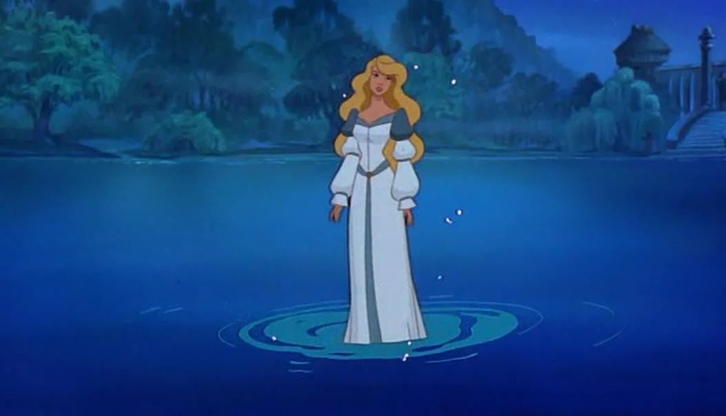
In light of this, I'm going to look into creating more realistic, traditional looking illustrations, but through using digital methods to mimic traditional aesthetics. A few artists I'll be looking at for inspiration are Arthur Rackham, Beatrix Potter and a little Glen Keane for flavour.


This is a fairytale near and dear to my heart, but it's one I didn't come across as a child. I found it when I was a teenager, looking up old cartoons. Specifically, in this case, Grimm's Fairy Tale Classics, and the episode entitled The Coat of Many Colours.
For this brief, I plan to take inspiration from older illustrations, due to a trend I noticed when I was looking through bookstores. Generally, books of fairytales made for children tend to polarise into two camps, in regards to their illustrations. One with simple, childlike illustrations, and one with more grim, Tim Burton-esque illustrations. In recent times, there doesn't seem to be as much focus on the beautiful illustrations seen in fairytale collections from decades past. This is something that has saddened me, since I fondly remember the first fairytale book my mother gave me, a ratty old thing, but it had gorgeous illustrations. I commiserated with a group of friends in secondary school about the lack of good illustrated fairytale books, so I know that I'm not the only person who'd be interested in such a thing.
In light of this, I'm going to look into creating more realistic, traditional looking illustrations, but through using digital methods to mimic traditional aesthetics. A few artists I'll be looking at for inspiration are Arthur Rackham, Beatrix Potter and a little Glen Keane for flavour.
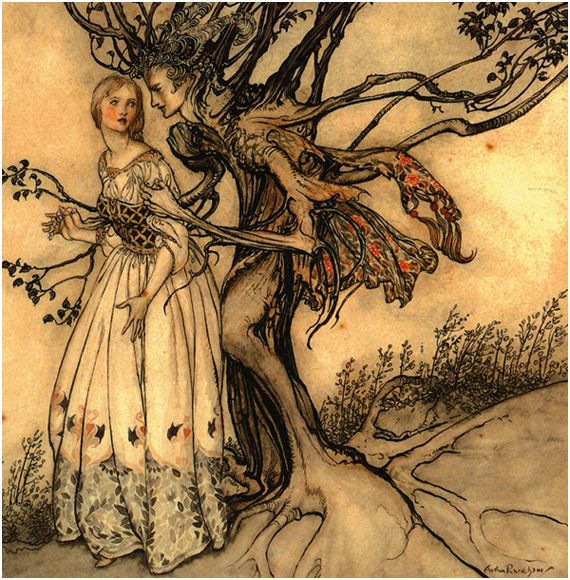
[Arthur Rackham]
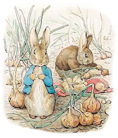
[Beatrix Potter]

[Glen Keane]
Subscribe to:
Posts (Atom)