Monday 29 December 2014

My Digital Media Project - Brief 1 - So Far

Brief 1 is a mascot for a professional event. For this mascot, I've chosen to use a robot as a basis, going for a happy and endearing, yet still slightly melancholy, feeling for the character. The end result of the brief is to be a Character Sheet, a website banner featuring the character, and a basic vector image that could be reused wherever the character appeared.

Since the character is a robot, I oh so creatively nicknamed it Robo. First I began with a few sketches to determine what I wanted the character to look like, including shapes I wanted to use, and a spider diagram to help generate ideas. I sketched a few different possibilities, looking for a good silhouette. I eventually decided to have his arms and legs be more noodle-like, such as the limbs of classic black and white cartoon characters, such as Steamboat Willie.

[Apologies for the picture quality, but I don't have easy access to a working scanner, so I'm making do with my Macbook's built in camera.]

My first decision in regards to Robo was that I really wanted him to have a TV for a head, inspired in particular by a robot from a Japanese anime, FLCL. However, FLCL's style is less simplified than the style I had chosen, so I used a more stereotypical TV-like appearance for Robo's head.


I also wanted his shape would be very simplified, reminiscent of Katamari, an extremely fun, yet extremely odd, video game made by Namco. However, I wanted the character to be a simplified silhouette, rather than mimicking the colourful look of Katamari


After I had a clearer idea in my mind of what I wanted out of the character's basic appearance, I started building him in Adobe Illustrator.


I split him into different parts, on separate layers, to make it easier to edit his pose if I decided to do that at some point. Taking this possibility into account, I made a sheet of sketches for pose ideas.


Currently, the white sections on Robo are just white lines, but I plan to have them be see-through instead. However, I'm not entirely sure how to do that, and I might just do that in Photoshop, when I add him to the banner, by changing his layer to Multiply. As the white parts are just lines, I also added a coloured square in the background, so that I could see the white parts in more detail. Robo himself is nearing completion, there's only a few small details to add, and then I just need to add him to his banner, and the character sheet, and lastly, save a reusable Vector image of him.


Monday 22 December 2014

My Digital Media Project - Oh boy

Greetings. I wondered if I would ever use this blog again, and it looks like the answer is yes. Are we going to act surprised that I haven't posted in a while?

Anyway, I've chosen to use this as a journal of my development, as I work towards my final Project, named Scheherazade: Living On a Tale. The project is named after a character from a fairytale, specifically, One Thousand and One Nights. The aim of the project is to build up more portfolio work, as well as a better understanding of the freelance illustration industry.

To achieve this, I'll be filling a selection of briefs, each aimed towards a different audience and purpose. The completion of these briefs will include a character sheet, and a prototype of the final product. These briefs are:

- A mascot for a professional event IE Pictoplasma

- The main character, a princess, from the fairytale Donkeyskin

- The main character of a comic, based around the Paladin archetype from gaming

- A merchant character for a video game aimed at children

- A mascot for a family friendly chain of Italian restaurants

EDIT 09/01/2015: The order of the briefs had to be rejigged slightly, due to some unexpected information, and the fact that I need more time to learn about the software the Merchant character would require. And the fact that I desperately want to have the Donkeyskin character finished before the development deadline.

Wednesday 25 June 2014

Adventures in Photoshop 3: Electric Boogaloo

Story time, I got a Wacom Tablet for last Christmas. Ever since, every now and then, I've gotten it out to familiarise myself with it. I'm still having trouble drawing my usual style of people with it, and my neck always hurts after i've been using it, for some reason. I do have a few things, though most aren't finished, to show for my effort.


I've also done a couple of pieces by drawing the lineart in pen, and taking a picture with Photobooth to colour. I do it this way, because I don't have a scanner that cooperates with my Macbook, so it's more trouble than it's worth to try and scan my work. However, this has a drawback that it means the lineart has a rather low resolution. One of these pieces is somewhat Pokemon fanart, done for a "championsona" prompt, drawing yourself/your player character as the Pokemon champion, and what they would have gone on to do. I had decided that my character would have gone on to investigate the history of the Pokemon world, as that's always been something I found interesting in Pokemon.


Art Which I Forgot that I Didn't Post About

... Are they gone?

So hello again.

Looking back over a couple of posts, I realised that I haven't really put up too much of my own work, art that I've done for my own pleasure, and that there's at least one piece of art I've completely neglected to post. Namely, the completed illustration competition entry.

Friday 4 April 2014

Recent Reads - Knights

Knights is a Japanese fantasy manga which follows a young squire in the kingdom of Exclude, created by Murao Minoru, a writer artist team. The kingdom is gripped by a witch craze, with women being kidnapped, tortured, and killed by corrupt 'holy men'. Our protagonist, Mistletien, is infamous as 'The Black Knight', and he travels the kingdom rescuing these so-called witches with the aid of his best friend, Euphemia, among others. His mission is to end the witch hunts, by killing those involved with perpetuating it, and by foiling executions. Mist, as he is often called, is able to perform this mission, which goes against one of 'The Ten Precepts', this kingdom's rules of knighthood, because there are many who believe he will never become a full knight. You see, he is not called The Black Knight due to anything he wears.

He actually is black.

This presents a problem for him, as Exclude is an overwhelmingly white country. Almost every character who finds out about Mist's skin tone react in horror, having never seen a black person before. To add to it, the corrupt church labels black as an evil color, making many people believe Mist is a demon due to his black skin, and mistreat him.

One thing I find interesting in the art style of Knights is that, aside from the characters, the art reminds me a bit of a woodcut, a medieval method of creating art. Seeing as this is a manga that takes place in a medieval world, it seems very fitting.


Podcast Recommendation - Writing Excuses


Writing Excuses is a podcast created by a group of professional authors, all about how to tell stories. Each episode is only fifteen minutes long, meaning that the information is bite sized, the sort of thing you can listen to on short journeys or between doing other things. It also means that the group tend not to stray too far from their basic points, doing something they call "can of wormsing", which means that sometimes, if they stumble across a subject during their discussions that could lead to a larger tangent, they will add that larger tangent as the subject of a later episode. Another thing I like is that they aren't all one kind of storyteller, giving a range of viewpoints. One of the group, Howard, is even a cartoonist rather than a writer of novels. Finally, another thing I like about the podcast is the informal tone of it, something which I find helps me to remember their points and discussions better than if they had used a coldly professional tone.

Illustration

Over the past week, I've been working on an illustration, using a large number of my own characters as a crowd scene.

Firstly, I drew all the characters on an A3 sheet of paper, using pencil skeletons to ascertain the character's positions and poses, before inking them in pen. As you can see, the inking process went through a few hiccups, and there were also a few extra versions of the piece that did not reach completion sue to smudging. These extra attempts taught me not to ink the way I usually draw, which is in a somewhat chaotic manner, starting wherever I feel is the most convenient. However, while doing this, usually I will end up having to rest my arm on parts I've already drawn. This is fine on quick drying biro, or pencil, but with ink pens such as the one I used to ink this, it causes smudging.

The above photo was taken with a camera, as I did not have access to an A3 scanner. However, a photograph like this is not as high quality as a scan would have been. That meant that I had to carefully fix the linear, so that it would be clearer.

I realized while I was trying to fix the linework that there was a problem. If one side of the linework looked good, the other side would either look too dark or too light. To combat this, I created a copy of the linework layer and used gradient mapping on each. On one, I set the gradient map so that one side looked right, and on the second I used gradient mapping so that the other side looked good. After that, I deleted the dark section on one layer, set them up so that the overlapping made the complete image look good, before combining the layers.

After doing this, I thought to begin coloring it. However, the computer I was on had a difficult to use mouse, and all the other computers in college were taken. So I did some preliminary colorings, not bothering to keep it tidy, as I intend to finish coloring it at home.

My targets for the Easter holidays are:

  • Finish coloring and shading the illustration.
  • Start the writing for the college modules that I will have to hand in the week after Easter.
  • Look into Illustration Friday, and it's prompt.

Friday 28 March 2014

Research - Contemporary Influences

Fluorescent Hill
http://www.fluorescenthill.com/video/onyourway.html
Mark Lomond and Johanne Ste-Marie, also known as Fluorescent Hill, direct animations for music videos, festivals and adverts. Their animations tend to involve at least some traditional animation, often including photographs or digital work. For instance, one of their music videos, for the track "On Your Way", uses traditionally animated characters and what I sincerely hope are photographs for the background, because if they are animated or painted, they look far too realistic. I quite liked the aesthetic, because I feel the colours were nice, with the greens and the brightly coloured characters.

Weirdly, the characters somewhat remind me of the Gruffalo. I, personally, feel like I'd like to have textured trees, but I'd like my trees to look more fanciful, because I'd like to try and mimic what I imagined when I was a child, when I was told stories. When I was told about twisted trees, for instance, I would always imagine twisted up paper. Perhaps I will make a set, but not with real trees the way this was (hopefully) made.

Saimon Chow
http://www.saimanchow.com/
I have to say, I'm not a fan of this guy's work. I am not a fan of art that supposedly has a deep meaning, which is completely not apparent in the art itself. Sometimes I can deal with it if the art itself is visually pleasing to me, but I feel this isn't due to the confusing shapes and colours.
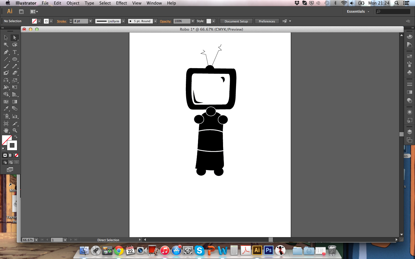
I think the one piece of work I like from this is the very non-indicative Goopocalypse adverts. I really enjoyed those, and how they worked with the fact their characters were Creme Eggs. For instance, one of the Screme Eggs, acting like zombies, is split in half, and 'crawling'. Since it's a Creme Egg, it doesn't leave a trail of blood, but filling. I find it interesting that they took a situation that, were the characters human beings, would be horrific and gory, and turned it funny.
I also think it was quite interesting that the creators have made characters that I can feel empathy for... Out of eggs. This is especially evident in the "Last Stand" advert, where three eggs escape the Screme Egg zombie apocalypse. I was honestly quietly cheering for these characters during the video. I think a big part of how these Eggs have made such good characters is that they have very clear personalities. One starts the animation hiding, clearly a civillian, another egg has a Rambo-style bandana, and is clearly the action hero leader.
Also, in the "Last Stand" advert, the Creme Egg survivors have a suped up car with whisks on the wheels and a spatula on the front. This is a hilarious addition, because the additions are cooking utensils clearly associated with eggs, and it's an interesting parallel to real life when the situation is an apocalypse of zombie chocolate eggs. Also, Creme Egg survivors in a Mad Max style weaponized car. It simply must be seen to be believed.

Bruno Mayor
http://www.brunomayor.com/
I'm somewhat apathetic of this man's work. A lot of it is designed to look a little bit creepy, which is actually a thing I often appreciate. I believe he uses some rotoscoping on some of his animations, putting different images on top of some edited film of a live person.
However, my personal favourite of his animations is "Guerre Naive". This film has 3D animation, designed to look like stopmotion, and with some 2D effects put on top. I like this, because it creates an interesting contrast, with the brighter 2D effects, yet they also keep a strange kind of togetherness, with the cartoonish designs of the characters. I doubt I will take much from this man's work, due to my wish to have a very different aesthetic for my own animation.

Joel Trussell
http://www.joeltrussell.com/
I quite like this guy's work! I find it interesting how he creates engaging characters out of inanimate objects, with animation digitally rotoscoped over the top. Of course, he also does animations another way, which is 2D animation. However, his puppetry is more recognisable. I think my personal favourite of his works is "Carrot and Stick", about, well, a carrot and a stick. What I like about it is the aforementioned engaging characters out of inanimate objects, but also how there's a combination of how he uses the puppets. Usually, the characters are obviously props held in someone's hands, with facial expressions and such rotoscoped on top.


But, in long shots, the faces vanish, and the props are simply used in conjunction with a live dog. The reason for this is explained in the animation.


SWOT Analysis

To learn about what skills the careers that I would like to work in in the creative industry would require, I went to creativeskillset.org and had a look at how my skills and weaknesses would apply. However, I also had to examine my skills on their own merits.

Strengths
  • Good at drawing
  • Especially frozen motion
  • Creative
  • Film literate
  • Leadership qualities
  • Storyteller
  • Understanding of image layout and composition
Weaknesses
  • Decision making
  • Organisational skills
  • Drawing consistently
  • Tact
Opportunities
  • In College for a creative industry course
  • Competitions such as the Macmillan Prize and Illustration Friday
  • Websites
  • Word of mouth
Threats
  • Judgement based on my disability
  • Communication problems
  • Lack of confidence with software
  • Lack of confidence

Skill Analysis in Careers
I went into creativeskillset.org and examined different careers in the creative industry, before comparing my skills and weaknesses against the skills that would be required in the specific careers.

Storyboard artist
Skills: Film literate, good storyteller, understanding on sequential imaging, layout and composition. Should be able to work either alone or in team, and take direction.

Needs Development: Drawing consistently, everything the same size. Familiarity with storyboard software.

Animator CGI
Skills: A feel for movement and timing, creative and artistic qualities, appropriate technical skills. For character animation, acting talent, observational skills and animation experience. Take direction, work in a team. Organisational skills, communication skills and attention to detail.

Needs Development: Animation experience.

Director
Skills: Creativity, imagination, artistic flair, storytelling, film literacy, leadership qualities.

Needs Development: decision making, organisational skills, tact, management.

Illustrator
Skills: Drawing skills, working to a brief, Creativity, understanding of computer graphics


Needs Development: Time management, selling ideas and making presentations

Adventures In Photoshop 2: Revenge of the Linework

In College, we've been asked to create pictures for a thing called the Lookbook, a book filled with examples from the students work, as well as a profile written by the students themselves. One of these images is the profile image, created in A3, but meant to be sized down to a tiny image. We created them in A3 so that we could later print them out full size and use them as portfolio work.

I may have gone slightly overboard on it, I created four.

This is the first one I completed. It was part of a full character, but I decided that the arm holding the axe would look cool as it's own image. I outlined the pen drawing in Adobe Illustrator, as I did for each of the following pictures, but this one is distinct for the fact that I selected a different style of line, one which looked like pencil lines. I decided, upon selecting that line style, that I wanted this piece to look hand drawn, as if it had been illustrated in a book. Hence using a texture of old paper, and letting myself miss spots when colouring.

This one I decided to give a somewhat pop-art like look, with flat colours and invisible linework over a gradient background. I'm somewhat annoyed that her rope vanishes into the background at points, but I feel it would likely draw too much attention to it. I'm especially proud of her right hand, and how it looks lined.

This one is more traditionally coloured and shaded, but it also has invisible linework. The character featured is the character I play in Dungeons and Dragons, whose name is Bree Cedarfoot. I chose to make Bree's linework invisible, as it gave the image of her an airier appearance, which I felt suited Bree as a character better. Bree is something which, in Dungeons and Dragons, is called a Halfling. However, Halflings in Dungeons and Dragons are inspired by Tolkien's Hobbits. In turn, Bree's outfit in this image takes heavy inspiration from Bilbo Baggins' outfit in The Hobbit movies.

This was the final image I completed, as well as the one which I chose as my profile image for the Lookbook. Similar to the first drawing, I wanted to lend this one a hand drawn appearance, through missing spots while colouring it. However, where before I wanted it to look like an illustration in an old book, this one I wanted to look childlike and innocent, like how I imagined the bag to be. I gave it a simple striped background, with warm brown colours to accent the bag itself. I wanted the bag to be visible, but not to pop too much.

Friday 28 February 2014

Well, This Took a While - 28/2/2014

Yeah, I have some problems with getting on this blog with any regularity. My apologies.

Ahem.

So, this module has been to make an experimental, visual based ident for a competition for DCM, a company that advertises movies. We are expected to learn about abstract imagery, but also about compositing. I'm going to try to start from the beginning.

At the beginning, we all had a discussion about emotions that we felt during various films. We made spider diagrams of our personal favorite movies, mine being Pacific Rim, about the different emotions we experienced during specific films. After that, we all discussed what colors, shapes, and movements reminded us of those emotions. I have some trouble with abstract imagery like this, as I cannot really equate a random shape to an emotion. I can understand the aura of certain shapes in context, I know that if a character is made up of triangles they look more sinister, and if they're made up of circles they look softer, dumpier and more friendly, but the shapes by themselves don't seem to have a strong enough aura by themselves.

Next, we started experimenting with compositing shapes onto images we found on the internet.


After that, we experimented with techniques of creating abstract imagery, such as the extrude tool and different render and material settings.


After this, we experimented with specific emotions in photographs by compositing photographs together using the DCM logo.


With that, we experimented with specific emotions in abstract imagery, making things on Cinema 4D after researching our chosen emotions. The three emotions I have chosen to explore are fear, sadness and excitement.


I also tried testing these images by compositing them into the DCM logo, to see how they will fit and get an idea of what I can use them for.