Thursday, 31 January 2013

Modelling a Character 2 - Chest and arm

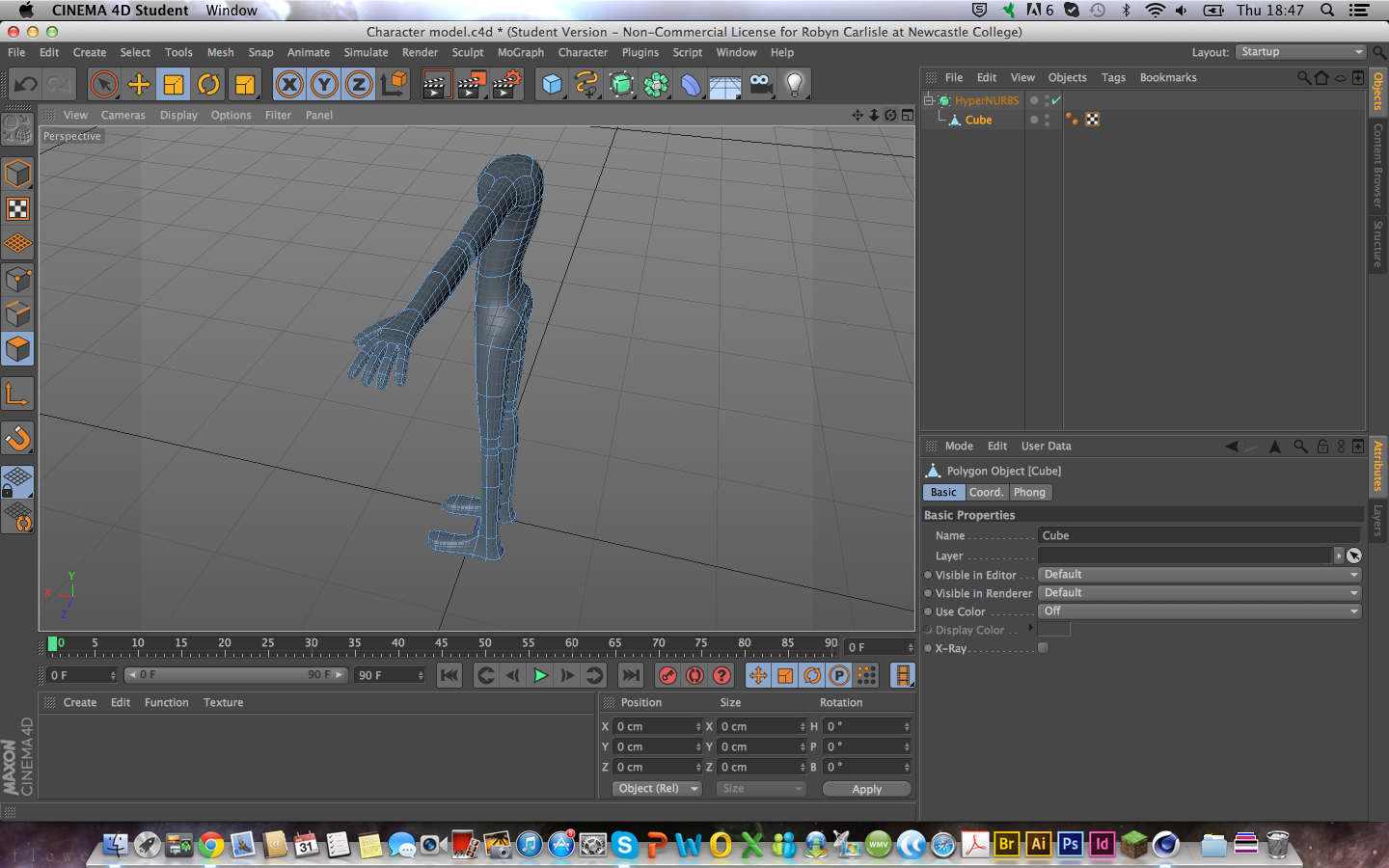
Pretty close to fully modelled, though I do doubt that I'll manage the target to rig it as well.
The midsection is made up of three segments, to give a better shape to the torso, including a small arch in the back. I cut out a box to grow the arm out of, because if you actually were to spread your arm out to the side, you would notice that it isn't perfectly in line with your back.
I also made one of the hands, which I am very happy with. Though I am dreading having to repeat the process for the other side.

Wednesday, 30 January 2013

Modelling a character 1 - Legs and hips.

The feet were a bit tricky, to remember to model them symmetrically, using the same photo of a foot as reference. I'm quite proud of the shape of the legs, but I am going to have to make the legs and hips wider from the side. They're much too thin at the moment.

Friday, 25 January 2013

Week's Reflection 25/1/2013

This week, I started modeling Thomas in Cinema 4D. I enjoy 3D modelling, it's like sculpture but with much steadier hands than I have. David taught us how to model a character with the Extrude tool.

I used the character elevations we'd made to make sure we would create the character properly, with the correct proportions, and so that it looked at last similar to the actual design.


I did my modelling by creating a box, then using the Extrude tool to grow it into more, shapes and limbs. I began with the feet. I ended up having to mess with the size of the legs soon after this screenshot, since they cut through the boots.

I used HyperNURBs to round the shapes of, to make them look more aesthetically pleasing and stylised. I am exceedingly proud of how these legs turned out.

I also tried my hand at modelling a hand, as was also taught by David. Again, I began with a box, changed it's shape so it formed an acceptable palm, and used the Extrude tool to create the fingers, thumb and arm.

And, of course, I used the HyperNURBs, to give the arm a curved, aesthetically pleasing appearance.

I realised that to create a noticeable shape to the limbs in this method, the shape has to be fairly exaggerated in the original block appearance.

David also taught us about the lave tool, which takes an outline and creates a circular shape from it, such as a wine glass with half the outline of one. I created a vase, and afterwards we were encouraged to try out different textures on it and... Well...

---

At home, I created another leg, without making it obvious whether it was right or left, duplicated it, and tried to see if I could create a pelvis on my own.
As you can see, this did not quite work.

I have some targets for next week, I would like to create a better character model, and perhaps see about rigging it. I likely will not manage to do the whole of these two targets for next week, but I would like to at least make a start.

Monday, 21 January 2013

Colouring Thomas

When I was deciding on what sort of colours to give Thomas, I felt that I wanted to look to nature, mainly seasons, for inspiration. This was because Thomas is meant to be a man who doesn't get out much, due to being sickly, but he wishes he could. I chose autumn because it strikes me as being the sickly season, Winter is too dead, but Spring and Summer are too full of life. Autumn falls in the middle perfectly.

We were taught in College how to colour using Illustrator, with layers and the pencil tool. I had much less trouble working it out than the pen tool, and it also gave very nice results.
I plan on Thomas wearing a loose fitting robe on top of this... Onesie for want of a better word, but drawing him without the robe is better for getting a sense of his actual body shape, which will be what is actually moving when he is animated.

Friday, 18 January 2013

Week's reflection 18/1/2013

This week, I did some work on drawing my character over monday and tuesday.

I also did an expressions sheet, which will be added presently. I had some problems with consistency, as the drawings kept changing size, and I had trouble drawing straight lines to help keep the proportions consistent. My helper taught me a technique using two rulers (or in our case, a ruler and a straight piece of foam) to make sure the lines are straight, which was extremely helpful.

There were also lessons in how to use Adobe Illustrator, for which I used a random drawing from my own personal sketchbook.
The lineart was done in Adobe Illustrator, though this is not the final lineart. It is, strictly speaking, a draft, as I went back later and changed the owl's tail and a few lines in order to make it look smoother. I'd put too many points in the owl's wings, which made them look bobbly. I had a lot of trouble colouring the lineart in Illustrator, so instead I took the lineart into Photoshop and coloured it there.
A problem I came across was that I couldn't simply fill areas with colour, with the Paint Fill tool, as the lineart had openings where the brush I had been using ended but the line itself intersected with another line. Photoshop couldn't recognise the part of the line that wasn't visible. This also meant that I couldn't select areas with the Magic Wand tool, which meant that I had to be quite careful not to wander over the lines. Sadly, no amount of care will keep it from ever happening.
So I ended up having to go back over with the Eraser tool. I decided, after colouring to go back and fix the lineart, so that it didn't look so bobbly. This is the final lineart:
There had been some small parts that I could in fact colour in Illustrator.

After doing that as practice for lineart in Illustrator, I drew lineart for one of my character's elevations.
(Also, the guy's name is Thomas, which I shall be calling him from here on) I have been finding some difficulty in understanding the Pen tool in Illustrator, but I can't argue with the results. The lines look good so smooth.

I have a few targets for the next week. First of all, to colour my character. Secondly, to create some brushes for Illustrator at home. Lastly, to make a model of my character's head. This ought to be fun

Tuesday, 15 January 2013

Character Design Influences 4

The Dragonart books.

These books taught me many things that turned out surprisingly transferable. for instance, how building a character out of certain shapes can completely change their presence, what sort of character they look like. Triangles make things look sinister, circles make them look soft and cute, squares look strong. There's also how to use complimenting and contrasting colours in character design.

Monday, 14 January 2013

Character Design Influences 3

Dreamworks is where I learned how to design multiple characters so that they complimented or played off each other. Mostly, Miguel and Tulio from The Road To El Dorado, my favourite movie as a child.

Tulio is tall, dark haired and thin, while Miguel is short, Blonde and has broader shoulders. There is also the fact that Tulio wears blue, while Miguel wears red. Blue is seen as a calm colour, and Tulio is the calmer, more calculating of the two. Miguel, on the other hand, wears red, a colour associated with emotion and passion. He is the more emotional and enthusiastic of the two.

This is Toothless and Hiccup, from How To Train Your Dragon, my current favourite animated movie.  Hiccup is small and wiry, while Toothless is large and intimidating. Most of Toothless' design is to make him threatening, give him a strong presence. On the other hand, Hiccup is small, designed to vanish into the background a bit, with the natural colours in his clothes. Where Toothless is big, Hiccup is small, with a fur vest that is far too big to make him look smaller still.