Monday 15 June 2015

30 Day Character Design Challenge - Day 14


14) Go to this random name generator and design a character for whatever name you get. Tip: you can click each name to learn its origin and meaning.
So, as you can see, I got Osmund Perkins. I can’t hear the name Perkins without instantly seeing someone slightly nervous, and involved with some kind of academia. Put together with the name “Osmund”, something swung that into a fantasy mage academic who doesn’t talk to people much.
(Yes, I know I did this and a few others a day late, but I figure it’s not so bad to forget a few days as long as I still do each of the prompts. I’ll still develop my skills, even if I don’t strictly manage it in 30 days, yknow)

Saturday 13 June 2015

30 Day Character Design Challenge - Day 13


13) Pick an order of angels and design a character based on/inspired by their description. The resulting character doesn’t necessarily have to be an angel. Bonus: pick Thrones, the giant wheels covered in eyes.
Yeah, day 13 was an interesting one. I looked through the list of angels, and decided to use the Cherubim, as I thought it had a particularly interesting description. I can probably blame my interpretation of the four faces a little bit on Koh the Face Stealer from ATLA, though afterwards I looked at it and thought to myself “this looks Lovecraftian as all hell. Well, better not do it halfway”. Hence the flying dinosaur wings.

Friday 12 June 2015

30 Day Character Design Challenge - Day 12


12) Design a high fantasy character whose outfit is based on whatever you’re wearing right now.
Challenge day 12, and as you may be able to tell, I had a lot of fun with this one. My current outfit is my favourite set of pajamas, which feature pants with a teacup pattern. I definitely wanted to incorporate that as soon as I read the prompt. Hence the teacup hip thingies and the weird kinda camo on the pants. Mostly, I like the tunic, which is based on this hand me down shirt that’s like 5 sizes too big for me.
Please ignore how shitty the fire is. I tried to follow a tutorial, and it didn’t quite work out for me.

30 Day Character Design Challenge - Day 11


11) Pick your favorite mythological figure and create two designs for them: one that’s as historically accurate to their time period and culture as possible, and another that takes as many artistic liberties as you want (this could a modern AU, something in your typical style, etc.).
I probably should have done Persephone, going by mythological figures rather than species, but I decided against that and went in favour of the Grecian Sphinx.
The “historically accurate” one probably doesn’t look too accurate, but that’s due to my sudden “how the fuck does this creature dress itself” moment. That kind of ended up being the theme throughout. I decided to give them sort of Lion King style paws that kind of act like hands, but they still wouldn’t be terrifically dexterous. And that’s not even getting at the wings.
I kinda want to write a short story from the modern Sphinx girl’s perspective, about how she’s annoyed with things that require or are much easier for bipedal creatures that have hands, because everything’s designed for humans not creatures. I think it might be interesting to write, once I’m done with the challenge.

Monday 8 June 2015

30 Day Character Design Challenge - Day 10


10) Create a color palette based on the colors in your bedroom, then design a character from this palette. Bonus: don’t use the colors of your walls or floor in your palette.
The problem with this day’s prompt, for me at least, was that I quickly realised something. My room doesn’t have very many colours. Things are red, things are white or things are wood. I assumed I wasn’t allowed to use my dragon collection, by virtue of that having more than enough colours included to cover most characters I’ve ever created. So, I used the wall for her sash, picture frames for her pants and boots, and took her brown hair from the fact that most of the women in the posters in my room are brunettes.

Sunday 7 June 2015

30 Day Character Design Challenge - Day 9


9) Design a character inspired by this poem.
Day 9, and this might require a bit of explanation. For some reason, when I read that poem, the image I got was some office guy looking back on his life, old ambitions to take on the world, and how he’d let himself get into a rut in a dead end job. So I figured he’d be as good a character candidate as anything. I liked doing his hair the best.

Saturday 6 June 2015

30 Day Character Design Challenge - Day 8


8) Draw a non-human character— the less human-looking, the better (so avoid things like elves, vampires, etc.). Bonus: Make up their species instead of using existing mythological creatures.
Day 8. I decided to try drawing this one straight on paper with a pen. Partially because I haven’t for a while, partially because I’m sitting downstairs right now and it’s late. I forgot to do it earlier, so I’ve just quickly put down a quick… Wolf griffin? I dunno, but she looks cool and her name is Dyrene. I actually like the idea that she’s a queen of a ruler of her culture.

Friday 5 June 2015

30 Day Character Design Challenge - Day 7


7) Design seven pairs of shoes. Bonus: for some of the pairs, make the left and right shoes different, but still recognizable as a pair.
Shoes for day 7 of the challenge, and I’m pretty happy with the result. I don’t practice as much as I probably should, so it was interesting to just draw a bunch of different shoes. Really, I understand how feet themselves work, and how the fit into heels and such, it’s just ankles that look weird when I draw them.
I think my personal favourites are 7 and 5, just because I feel like I got across a lot of what kind of person wears these kinds of shoes.

Thursday 4 June 2015

30 Day Character Design Challenge - Day 6


6) Go to this random aesthetic generator and draw a character inspired by the result. Bonus: make the design 100% serious, even if you get “dad wave” or “soap flapper.”
Day 6, and I got “Bird Skeleton” from the aesthetic generator. Now, this excited me, as this is actually kind of a redesign of a character I’ve been kicking around in my head already. She originally came about from the idea of the most cheery and unthreatening grim reaper to walk the Earth.
Her basic concept is that she turned up unexpectedly in the afterlife, and, since none of the Powers-That-Be could decide what to do with this situation, she essentially got assigned as the Grim Reaper’s assistant. Hence her outfit featuring bones, or more specifically, bird skeletons.

Wednesday 3 June 2015

30 Day Character Design Challenge - Day 5


5) Design ten unique hairstyles. Bonus: do a turnaround of each one.
Day 5, and I know jack shit about hairstyles, or how to draw microbraids in my art style. As you can see on style 3, braids I draw are huge and bulgy, and that doesn’t translate well to microbraids.
Frankly, I only like 3 of these, and they are 1, 5, and 7. They are also the only ones I felt even a slight urge to colour, but it’d have looked weird that only 3 designs were coloured, I’m sorry. So instead of just leaving it black and white, I just reduced the opacity on the planning layer so it could fill the space.

Tuesday 2 June 2015

30 Day Character Design Challenge - Day 4


4) Grab your oldest sketchbook that you can find and pick an old character to re-design. Bonus: pick the character by opening to a random page instead of hand-choosing.
Day 4! This has a mildly interesting story. You see, me and my family fairly recently did Spring cleaning. We put all the filled sketchbooks in the attic, which I can’t get into, since I’m scared of heights, and yes, I’m that pathetic in regards to it.
However, wonder of wonders, I had my Deviantart. My deviantart that I’ve had since I was I think thirteen or fourteen. I went on the oldest page there and grabbed an old drawing of one of the many Kingdom Hearts OCs I’ve amassed over the years. I considered redesigning Amy Terasu and make her notculturally appropriative as all hell, Jesus thirteen-year-old-me. However, I decided against it since, frankly, I want it unmolested to remind myself occasionally that I was a goddamn idiot at that age.
Now, on to the actual design I did. For all I harp on gritty reboots, I sure jumped at the chance to do the same to my own Kingdom Hearts OC. In the original, she was just supposed to be a history buff who kind of gave herself a challenge to make a keyblade of her own. In the redesign, she’s a full on archeologist, in a more Lara Croft 2014 situation, an expedition gone south in a big way. Except, instead of a weird devil island, here we’ve got Heartless.
Please don’t ask about what’s on her bandolier or in her hand, I can never remember jack shit about items from games. Also, that keyblade was so hard to try and update, and I’ve not drawn keyblades in a while, that’s my excuse.

Monday 1 June 2015

30 Day Character Design Challenge - Day 3


3) Draw five mouths, each of which reveal a unique character. Bonus: all are making the same expression.
Day 3 of this challenge! I really enjoyed this one, I liked trying to get across character with just a view of their mouths. I’m tempted to grab these mouths and run off into the sunset with them for some new OCs.

30 Day Character Design Challenge - Day 2


2) Design a character in a genre you don’t normally draw (example: if you normally high fantasy characters, you could do sci-fi, steampunk, etc.)
Day 2 of this challenge! Since I usually draw high fantasy, and girls, I figured I’d go for Sci Fi, and draw a dude. And this time, not give him a background that includes a building.
I figure the gauntlets and belt don’t match because he actually scavenged them/stole them because they have much better technology than the rest of his gear. Don’t ask me how, tho.
But yeah, now you can see why I usually draw High Fantasy XD

(Apologies, I forgot to post this yesterday)

Saturday 30 May 2015

30 Day Character Design Challenge - Day 1


1. Put your iTunes library, favorite Spotify playlist, etc. on shuffle and design a character inspired by the first song that comes up.
So this is day 1 of this character design challenge. I went on Spotify, picked the first playlist I saw. I couldn’t be bothered to try and find a playlist I’d never heard and didn’t think I’d hate.
It was the musicals playlist. And the first song I got was Ten Minutes Ago from Roger and Hammerstein’s Cinderella.
I thought designing a version of Cinderella would be way too obvious so you get... An unusually young Fairy Godmother, with a bit of a pumpkin theme.
Also, fun trick, due to how I shaded her, if I turn off the visibility on her flat colours, she instantly turns into a ghost.
Finally, please ignore the perspective on the window. Why did I decide to use a background that requires drawing architecture again?

30 Day Character Design Challenge - Intro

So I'm going to give a try to this 30 day challenge. Basically, every day has a different prompt and you have to draw something to that prompt. I'm gonna start today, and try to do one a day.

Wish me luck.

Friday 8 May 2015

My Digital Media Project - Brief 3 Prototype

I detailed pretty much the whole process of making the page in a previous post, so instead, I'm just going to detail what I changed while finishing it.


Instead of having two layers of tone to shade the jewel on the shield, I decided to just have it and the main body of the shield be slightly different shades. However, that experiment told me that layering tones was a functional plan, so I used it on the backgrounds of the second and final panel. On the final panel, I also added action lines, to increase the impact of the... Well, impact. Finally, I changed the clang sound effect's colours so that it popped a little more.

Now, on to the character sheets...

Thursday 7 May 2015

My Digital Media Project - Brief 2 Prototype

Brief 2 was the illustration for Donkeyskin, which I posted briefly about before.

Firstly, starting with the scanned image, I did the obvious first step. Flat colours. After that, I added textures to the walls and pillars, to make them look more like stone or marble.


With those parts done, I considered what I wanted to do for the shading. I decided to shade all in shades of brown, to help keep the colours warm, which I hoped would make the dress stand out more, as it's a cooler colour than the rest of the room. To shade I created a layer on top of the colours, but below the lineart, and used the shades of brown to create shadows and highlights where I wanted the light to be shining.


After that, I decreased the opacity...


Which made it look like this:


Then I added the words, a small section of the story of Donkeyskin, that describes what is going on in the illustration.


And finally, I layered two old paper textures on top of the whole piece. However, in doing this, I was bothered by how much the dress didn't pop, underneath all the layers of brown I'd put. I wanted the dress to have the appearance that I was almost glowing. So, I went onto one of the paper texture layers, and erased the texture that covered the gown. I felt that that made the dress pop in a more pleasing way. You can see where I erased if you look closely at the layers.


Wednesday 6 May 2015

My Digital Media Project - Brief 1 Prototype

The prototype for the first brief was a banner for a website, in this case, I looked up the dimensions for a Twitter banner (So that I can use it for my Twitter, because I'm a filthy cheater).

I had a very particular idea of what I wanted this image to look. Joyfully, I soon discovered...


This would be the easiest thing in the world to do. Seriously, it took me all of a half hour. Granted, I already had the character (Robo) drawn in Illustrator, and that definitely took longer, but it was also long done, before even the development deadline.

I just selected a square, and used the gradient tool to create the fade effect I wanted. Then it was only a matter of adding the desired words on top. I'm fairly sure I spent more time picking a font than putting in the lines.


Seriously, less than half an hour.

My Digital Media Project - Game Plan

Okay, so I've finished all of the prototypes for my briefs.

I have to post about how I did them.

I'm gonna do that in order of brief number.

Okay? Okay.

Wednesday 29 April 2015

My Digital Media Project - Page of Paladins

So, first of all, I finished off the illustration of Donkeyskin, and I will make a post about those finishing touches later, but right now, I have a tone of screenshots from making the test page for the Paladin brief. (Small warning for language in the sketching stage)


First, I used the sketch tool in Manga Studio to roughly plan out each of the panels. I also, on the fly, changed the design of the shield, to make it a little easier to draw consistently.


Next, I used the pen tool to draw the final lineart.


I experimented some with the screentone tool, the feature which drew me to Mangastudio when I first purchased it. It was during my weeaboo phase, okay. I used two layers of the same tone on the jewel, to see if I could use that to shade the jewel. The experiment worked, but it might look a little weird, combined with the big shine I put on it in the lineart.


I've added all the dialogue using the character tools in Mangastudio. I find it really handy that they have hundreds of different speech bubbles to choose from, including ones that would be supremely difficult to just draw straight.

Friday 24 April 2015

My Digital Media Project - Colours and Textures for Donkeyskin

Finally! With the dissertation out of the way, I can get back in the saddle on the practical work for my project.

This week, I dedicated to working on the Donkeyskin illustration, as that has a chance of taking the longest. I've got it mostly done, just shading to do. The original plan was to mimic watercolouring in Photoshop, however, I couldn't find a tutorial for it that I found satisfying for filling my vision. So, instead, I chose a flatter, brighter colouring style, mimicing a book of fairytales I once had in my own youth.


Thursday 19 March 2015

My Digital Media Project - A Minor Snag

My Laptop's had to be wiped. Pretty much all of my college work's safe, but...

Reinstalling all the software's going to be fun.

Monday 9 March 2015

My Digital Media Project - What I've Been Up To

Well, first of all, I've been doing sketches of the Paladin character. I decided to use a heavier, rounder basis for the character, reminiscent of Amethyst from Steven Universe. As she is based around the Paladin archetype, her signature weapon could, logically, only be a sword or a shield. I decided on the latter, to make it more distinct.

[Amethyst, from Steven Universe, for reference]


After marathoning Sailor Moon a little more than might be recommended, I thought of possibly having the paladin character being a transforming hero, in the same vein. I sketched this costume idea before I came to the conclusion that the Sailor Moon inspired might be a little too much. However, I do like some of the armour pieces, inspired by a piece of art from the anime Revolutionary Girl Utena. I also decided that I liked the idea of having a ludicrously large shield, with handles on the back so that the character can grab one handle and swing the shield as a weapon.


This led to me doing several designs of the shield. I briefly tried a few designs for a smaller shield design, but I found them less satisfying, and less striking, than the idea of the character swinging a shield around that was as large as her. However, the original design for the large shield, as you can probably tell, would be hellish to draw consistently, hence the simplified version beside it.

I also began to sketch the turnarounds I would use on Donkeyskin's character sheet, but I quickly remembered why I do not usually use my higher quality pens. My preferred drawing pads have very absorbant paper, and, when using a higher quality pen, it soaks up the ink in the line and makes the drawing blurry. This annoys me to no end. I also realised when I was inking that I found the drawing generally unsatisfying, it didn't have any energy, and Donkeyskin was starting to look an odd shape.


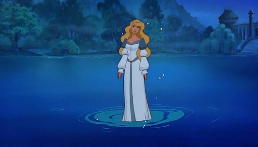
While watching some students from another course (Theatre, I presume, due to the fact that they were all doing speeches from plays (and one made a terrifying Hamlet)), I sketched and inked most of Donkeyskin's final illustration. It is of the climactic reveal, when Donkeyskin removes her fur coat to reveal the gown made of moonbeams, hidden underneath.


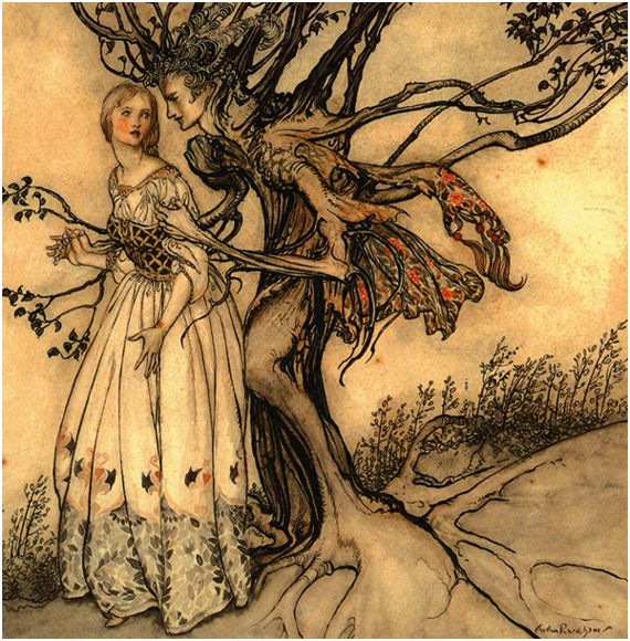
I based the frame around the drawing, and Donkeyskin's pose, on the art nouveau style, though simplified, in the case of the frame. I feel as though the prince and his servant look slightly out of place, timeline-wise, but I don't doubt that this is something that shouldn't be terribly hard to fix, should it bother me enough to do so. I've still not decided on what is going to fill the top right corner, probably more astonished courtiers or something similar. I outlined a box at the bottom of the linework, in which I intend to briefly describe what is drawn in the picture, a practice which I have observed to be common in Fairytale illustrations.

Lastly, I "attended" a livestream by a pair of fandom artists I admire. It was greatly informative, and I asked a great deal of questions about their workflows, which taught me some interesting tricks for digital colouring in Photoshop.


Tuesday 24 February 2015

My Digital Media Project - Change of Plans

So I may have overestimated myself. I overstretched my abilities, planned out my project in a way that it's proven to be too much. However, doing so has helped me in a way, at least helped me have a better understanding of what I want to do.

Firstly, I set up, in my original plan, the five briefs, and each one had it's own deadline, and several pieces that would make up the finished product. However, I set that up before I really had to start worrying about keeping the deadlines in my plan and the actual hand-in deadlines for college straight. The simple act of remembering what my deadlines were verses remembering the college hand-in dates turned out to be more stressful than it was worth. I have little to no worries about the work, that I could do everything I set out, but the deadlines scuppered me and sent me into a bit of a panic. My understanding of what I was doing kind of fell apart in the face of the college hand-in deadlines, and I have a problem where if I don't understand what I'm supposed to do, I won't do anything.

I also set them up to cover a wide range of purposes and markets, because at the time, I hadn't been sure what I wanted to do or what my target market would be. However, since then, I've gained a stronger understanding of what I want my career to look like, started to really think of myself as an illustrator, first and foremost.

In response to these problems, I took some advice I'd heard a few times, and reduced the number of briefs from five to three, specifically, Robo, Donkeyskin and the Paladin. I was upset over the fact that I hadn't completed any of my briefs to their original deadlines, but this way I should be able to finish them now, for the Realisation hand-in. Also, I'm just really fond of Robo, and still like drawing Donkeyskin. With this change of plans, the original deadline plans are kind of getting thrown out the window. Instead, I'm going to work on finishing off Robo and Donkeyskin while also doing the Paladin.

Which is currently involving some interesting Google Image searches for inspiration...


Thursday 5 February 2015

My Digital Media Project - Brief 2 - Some stuff I forgot to post about

I did some more sketches, and I feel confident that I have finalised Donkeyskin's design to my satisfaction.


These are sketches for Donkeyskin's dress before she ran away, along with sketches of how her appearance would change after she did so. I looked up stuff about regency fashion, including what regency era aprons looked like, though I decided not to add an apron to the rags. I liked the idea that, after she'd ran away, at first Donkeyskin's dress would be in tatters, but over the course of the story, it would be slowly mended. I felt it was a nice metaphor for her healing from the terror her father's madness would have caused her.


I actually drew the face sketches while waiting for a doctor's appointment. Again, I looked up some regency hairstyles, but in this case, I chose the bottom right, which was not pulled from research. I wanted Donkeyskin to look both practical and graceful, but I also wanted to give her a hairstyle that wouldn't be too hard to mess up, while still having her be recognisable.


Finally, Donkeyskin's ball gowns. In the fairytale, Donkeyskin goes to three balls held by the prince in three different dresses. One dress supposedly made of sunlight, one of starlight and the last of moonlight. Taking sun, moon and stars for the dress themes, I took some of the ideas from the initial sketches, and some research into regency era ball gowns. My personal favourite is the moon dress, which has a very appealing silhouette, and, once the phases were changed to a pattern along the hem, it's theme is very subtle, but noticeable when you know it's there. The first iteration of the starlight dress was based on a particular regency dress I found in my research, however I felt that the dress didn't work so well with my art style, and redesigned it. I liked the idea that there was an element of escalation through the balls, and therefore the dresses. The sunbeam dress is worn on the first night, and has a fairly simple design. The starlight dress is worn on the second night, and while more glamorous than the sunbeam dress, it's still somewhat less so than the beautiful moonlight dress, worn for the climactic reveal.

Friday 30 January 2015

My Digital Media Project - All Briefs - More In-Depth Explanations and Thoughts Thus Far

Brief 1 - Brief 1 was a mascot for a professional event, like Pictoplasma. An event where professionals in the sector would meet with each other, give talks, etcetera. This character, whom I nicknamed Robo, was intended to be a pleasant, happy character, yet one who had a slight melancholy about him. I wanted him to look like he had a life behind him, plausibly quite a long one. The final products I want for the Realisation handin are a character sheet, a reusable vector image of Robo, and a banner made using said vector image. Through working on him, I gained some extra practice in using Illustrator and Photoshop, though I am already familiar with these.

Brief 2 - Brief 2 is the main character from a lesser known fairytale. I, personally, prefer to call the fairytale Donkeyskin, but it has several names. This character has a rather traumatic backstory in the fairytale. This character's final products are to be her character sheet, three designs for the three gowns in the story, and a completed illustration of a point in the story. I rearranged the order of the briefs almost specifically because I wanted to do this one within the development deadline. This is the one I really want to do well, because it is the one most heavily placed in my area of interest, and using techniques that I enjoy.

Brief 3 - Brief 3 is a comic book protagonist, based on the archetype of a Paladin. A Paladin is a common class in Roleplaying Games, especially those set in High Fantasy worlds. However, one iteration of the paladin archetype I have not seen is one in an Urban Fantasy setting, a person in a modern world who has the abilities associated with Paladins. This was the concept I wanted to play with. This character would follow a fairly formulaic Urban Fantasy plot, where an Everyman character would gain unexpected supernatural abilities. Usually, though, these abilities would be based around a different archetype, say a witch or a medium, I've never seen it done with a Paladin. The final product of this brief is to be a character sheet and a page of her story, made using Manga Studio, with the help of a tutorial site I found.

Brief 4 - Brief 4 is a merchant character for a video game aimed at children. Merchant and Smith characters in video games, in particular RPGs, tend not to look very different from each other. Sometimes, I'd swear the smith characters were all the same man. Because of this, I think it'd be interesting to find something different to try, another angle for the character. However, this character's final prototype would be their character sheet, and an at least basic 3D model of them. While I have used some of the software before, I am not extremely confident in it, and I understand that there are differences between what I've learned about the software and how it is supposed to be used in creating assets for video games. This is why I have gotten in contact with another student, James, who works in the video game industry. I've asked him for help, when I roll around to this brief.

Brief 5 - Brief 5 is a mascot for a family friendly chain of Italian restaurants. The final products would be a character sheet and a short animation using Flash or After Effects. Originally, this was the first brief, but after some thought, mainly on the fact that I don't actually have easy access to the software required to do it, I decided to make it the last instead. Due to this sequence of events, I have done a good deal of thinking and made some very basic sketches. Originally, I was going to use an Italian cook as a base for the mascot, but I felt that was too obvious, too cliche. Instead, I decided to use an Italian grandmother, because I felt that would be a more interesting choice. There are several Grandmother tropes that I felt would be more fun to play with, such as grandmothers who have surprising backstories, tales of adventure and romance that clash with the wholesome image connected to old women.

Wednesday 14 January 2015

My Digital Media Project - Brief 2 - Initial Sketches


These are initial sketches. At first, I thought I'd try to design the coat, the iconic appearance of the princess in Donkeyskin, and also decide whether the coat would literally involve a donkey's skin as the head. However, when I had trouble visualising the coat, it struck me that I could try the design process a different way.

I own a number of old How-To-Draw books, and one which is particularly well-loved is "How To Draw Magical Girls" by Chris Hart. "Magical Girls" is a genre of Manga and Anime, which features a young (usually 10 - 18) girl who gains magical abilities, which usually include a transformation into a glamorous Magical Girl form. In this book, the author advises the reader to design the magical girl first, and design her ordinary appearance afterwards. This helps the artist establish the character, and means that they are less likely to go too far with the magical design, to the point where it looks ridiculous.

Because of this, I decided to do some preliminary sketches of the three dresses from Donkeyskin. These were mostly just me deciding on a theme for the three of them, what kind of fashion I wanted this fantasy kingdom to have. I tried out several ideas, icluding:

 a dress inspired by the fashion of the Regency era in England, such as the setting of the work of Jane Austen.


Stereotypical, vague "fairytale" dresses, not particularly based on an era. I, in the comments written on the page, made a jab at the fact that I felt one looked an awful lot like the dress worn by Odette, the main character in "The Swan Princess".


And, finally, a dress based on the stereotypical "Southern Belle", similar to the women in "Gone With the Wind".


I like the Regency dress best, and I feel it works with it's theme the best out of them, so I will be doing more sketches of the various dresses featured in Donkeyskin using the Regency style. Even so, I very much like the Southern Belle dress, and may be considering filing it away for use elsewhere in the future.

Friday 9 January 2015

My Digital Media Project - Brief 2 - Robyn Gets Overexcited For Drawing Donkeyskin

The second brief in Scheherazade: Living On a Tale is based around the idea of a book of lesser known fairytales, specifically, the main character of Donkeyskin. The final products for this brief will be designs for each of the dresses featured in the story, and at least one completed illustration.

This is a fairytale near and dear to my heart, but it's one I didn't come across as a child. I found it when I was a teenager, looking up old cartoons. Specifically, in this case, Grimm's Fairy Tale Classics, and the episode entitled The Coat of Many Colours.

For this brief, I plan to take inspiration from older illustrations, due to a trend I noticed when I was looking through bookstores. Generally, books of fairytales made for children tend to polarise into two camps, in regards to their illustrations. One with simple, childlike illustrations, and one with more grim, Tim Burton-esque illustrations. In recent times, there doesn't seem to be as much focus on the beautiful illustrations seen in fairytale collections from decades past. This is something that has saddened me, since I fondly remember the first fairytale book my mother gave me, a ratty old thing, but it had gorgeous illustrations. I commiserated with a group of friends in secondary school about the lack of good illustrated fairytale books, so I know that I'm not the only person who'd be interested in such a thing.

In light of this, I'm going to look into creating more realistic, traditional looking illustrations, but through using digital methods to mimic traditional aesthetics. A few artists I'll be looking at for inspiration are Arthur Rackham, Beatrix Potter and a little Glen Keane for flavour.

[Arthur Rackham]

[Beatrix Potter]

[Glen Keane]